

Modern product development is full of complex ideas. A small feature may involve user research, product requirements, API changes, analytics events, permission rules, design states, rollout plans, support training, and post-launch measurement. Each team understands part of the picture, but the whole system can be difficult to see.
This is why visual diagrams remain valuable even in teams that already use detailed tickets, roadmaps, design files, and technical documentation. A good diagram does not replace those materials. It connects them. It helps people understand how a feature works, what depends on what, and where decisions need to be made.
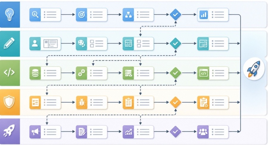
For product and engineering teams, diagrams are especially useful when a project is moving from idea to execution.
Complex projects fail when teams carry different mental models
Many delivery problems are not caused by a lack of effort. They happen because different people are working from different mental models.
A product manager may think of a feature as a user journey. A designer may think in screens and states. An engineer may think in services, data models, edge cases, and dependencies. A support lead may think in customer questions. A marketing team may think in launch messaging.
All of these views are valid, but they need to connect. If they do not, the team may discover problems late:
- A workflow has an unhandled error state.
- A new screen depends on an API that does not exist yet.
- A permission rule affects more users than expected.
- A reporting requirement was not included in the implementation plan.
- A launch promise does not match what the product actually does.
Visual diagrams make these gaps easier to find before they become expensive.
Start with the user journey
For product teams, the most useful first diagram is often a user journey or workflow. It shows what the user is trying to accomplish and how the product responds at each step.
This does not need to be complicated. A simple workflow can show:
- The user’s starting point
- The action they take
- The system response
- Any decision points
- Success and failure states
- Follow-up notifications or next steps
This kind of diagram helps the team discuss experience before implementation details take over. It also gives engineering a clearer view of the states the system must support.
Add the system view after the workflow is clear
Once the user workflow is understood, the team can add a system diagram. This shows the components behind the experience: frontend, backend services, databases, third-party APIs, queues, analytics tools, permissions, and admin workflows.
The system view answers different questions:
- Which service owns the data?
- Which API needs to change?
- Which events need to be tracked?
- What happens if a dependency fails?
- Which systems are affected by a rollout?
- Where should monitoring be added?
This is where product and engineering alignment becomes practical. The user journey explains why the feature matters. The system diagram explains what must change to make it real.
Use swimlanes for ownership and handoffs
Many projects slow down at handoff points. A feature may need product approval, design review, backend implementation, frontend integration, QA, documentation, and support readiness. If ownership is unclear, work stalls.
A swimlane diagram can help because it shows responsibilities across roles or teams. Each lane belongs to a function, such as Product, Design, Engineering, QA, Support, or Marketing. The steps move across lanes as work changes hands.
This makes hidden dependencies visible. For example, QA may need test data before final verification. Support may need screenshots before writing help documentation. Engineering may need product clarification before building an edge case. These dependencies are easy to miss in a list but clear in a diagram.
AI can accelerate the first draft
Creating diagrams manually can be slow, especially when the team is still exploring the problem. AI-assisted tools can help teams move faster by turning written notes into a visual draft. For example, a product manager can paste a feature brief, user journey, or implementation outline into an AI diagram generator for product teams and use the result as a starting point for discussion.
This is useful because the first diagram does not need to be perfect. Its job is to make assumptions visible. Once the draft exists, the team can correct it, remove unnecessary detail, clarify labels, and add missing states.
The review step is essential. A generated diagram should be checked by the people who understand the workflow and the system. Product should confirm that the user journey is accurate. Engineering should confirm that dependencies and data flows are correct. Design should confirm that states and transitions match the intended experience.
Keep diagrams close to decisions
Diagrams are most valuable when they are attached to decisions, not stored as isolated images. A workflow diagram should live in the product requirement document. A system diagram should be linked from the technical plan. A rollout diagram should be included in the launch checklist. A post-launch learning diagram should be added to the retrospective.
This keeps the visual tied to action. It also gives future teammates context. Six months later, someone can open the document and understand not only what was built, but why the team made certain choices.
Good places to use diagrams include:
- Feature discovery notes
- Product requirement documents
- Technical design documents
- Sprint planning
- QA test planning
- Launch checklists
- Incident reviews
- Customer support enablement
The diagram does not need to be beautiful. It needs to be clear enough to reduce confusion.
Avoid common diagramming mistakes
The first mistake is adding too much detail. A product workflow should not include every backend table. A system diagram should not include every button state. Keep each diagram focused on one question.
The second mistake is using vague labels. “Process data” is less useful than “validate payment status” or “sync account permissions.” Specific labels make diagrams more actionable.
The third mistake is creating a diagram once and never updating it. Product decisions change. APIs change. Rollout plans change. If the diagram supports a live project, it should evolve with the plan.
The fourth mistake is treating visuals as a substitute for discussion. A diagram is a tool for alignment, not proof that alignment already exists. Teams should use it to ask better questions.
A simple workflow teams can adopt
Product and engineering teams can use a lightweight process:
- Write the feature idea in plain language.
- Extract the user actions, system responses, and edge cases.
- Create a user workflow diagram.
- Add a system diagram for the implementation path.
- Review both diagrams with product, design, engineering, and QA.
- Attach the diagrams to the documents where decisions are made.
- Update them when scope or architecture changes.
This process does not add much overhead. In many cases, it saves time because the team catches misunderstandings earlier.
Final thought
Shipping good software is not only about writing code or defining requirements. It is about building shared understanding across people who see the product from different angles.
Visual diagrams help create that shared understanding. They make workflows, dependencies, risks, and handoffs easier to discuss. When used well, they turn abstract plans into something teams can inspect together, improve together, and ship with more confidence.