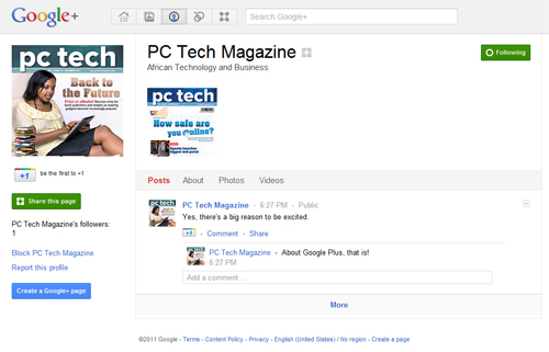
Type “+Pepsi” in the Google search field and you’ll see their logo, name and description in the dropdown. You can’t miss it; the row is twice as tall as the autocomplete results underneath and the logo adds the only color in the field. This open door to Pepsi’s Google Plus brand page is the layup and the prompt that follows — “Add this page to your circles?” — is the slam dunk. It’s a heavy enough push to a brand’s Google Plus page that some are even raising the anti-trust flag.
TARGETING
The web’s early promise to advertisers of hyper-targeting based on demographics and location never really came true to the extent we thought it would. Targeting paid ads in Facebook is easy but when it comes to Page content, most brands are blasting the same status update to their entire audience — or at best, countries and languages.
Google Plus makes it pretty easy to sort followers into groups (they call them Circles) and send targeted, relevant messages to these smaller audiences. Brands can create robust content calendars with posts intended just for certain cities, ages, gender and languages. Imagine Pizza Hut sending a family dine-in update to 35-year-old mothers in Toronto and a take-out offer just to 22-year-old guys in Thunder Bay. To brands, that’s gold.
DESIGN
Remember how shockingly simple Google looked in the early days 10 years ago compared to other sites? Their logo and clean white background stood in stark contrast to other search engines with 600 words cluttering the page. Google Plus looks to maintain that clean design and simplicity by showing just 4 tabs and 1 or 2 posts. The comment threads are compressed to a few lines and users can only respond, not post, so there’s no spam or angry uploads cluttering the wall. It’s easy-to-use and intuitive. They have a few bugs to iron out but overall this has been a solid launch.
Unprecedented reach, breakthrough targeting, and simple design. Add in the engagement potential of Google Hangouts, the social power of the Plus-1 button, and the possibility of a robust Google Plus Analytics package and you have the makings of a massive, effective, and unavoidable brand channel.
Credit: Huffington Post


