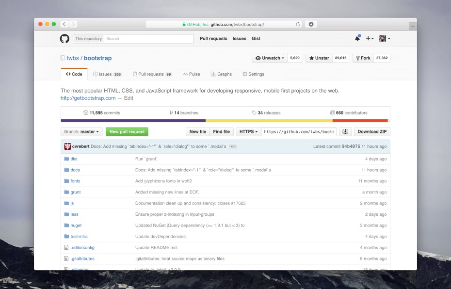
GitHub has revealed that in two weeks, it will be rolling out a redesign for all its source code repositories online.
The redesign will improve on the performance of repo pages, revealed GitHub director of design Mark Otto in a blog post.
One of the most visible changes is that the right rail is going away for the most part, leaving more room for files, issues, and pull requests.
“The collapsing side menu is now a single, always present navigation at the top of every page within a repository,” Otto wrote.
“This improves accessibility, makes navigating more coherent, and allows you to always see the labels for each tab without requiring tooltips.”
Another change is hidden. The new protocol switcher shows “explicit menu items with explanatory text for each cloning method instead of simple text links,” Otto wrote.
The image above is a preview of the new design.


