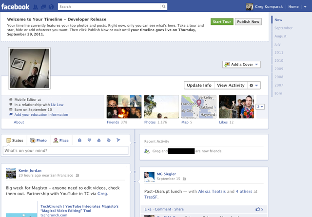
 Not very far back, Facebook introduced a new feature called timeline, Be prepared for yet another change to your Facebook profile: Timeline could soon be getting a makeover.
The social networking giant is testing a new design for profile pages that places all posts in a single column on the left, while activity updates, friends, places, apps and other sections are on the right.
The current format, a two-column layout, includes posts on both sides, forcing users to look back and forth. When Timeline rolled out site-wide last December many complained that it was confusing. One Facebook page, “I hate FB Timeline, and want to disable it ASAP,” was started shortly after its launch, and now has nearly 26,000 likes.
In its new incarnation, Timeline no longer has the vertical line that divides a profile in half. This change, ironically, makes it look less like a timeline, according to Inside Facebook, which revealed the updated design. Clickable dates that help users navigate through profiles, however, are still listed on the top right.
What’s more, modules on the right-hand side are now smaller than posts (they were the same size, before); so, Timeline has blank spots that would have previously been filled with posts. Facebook is testing the new format with a “small percentage of users,” it told Inside Facebook. The company did not immediately respond to Mashable for a request for comment.
Source: Mashable
