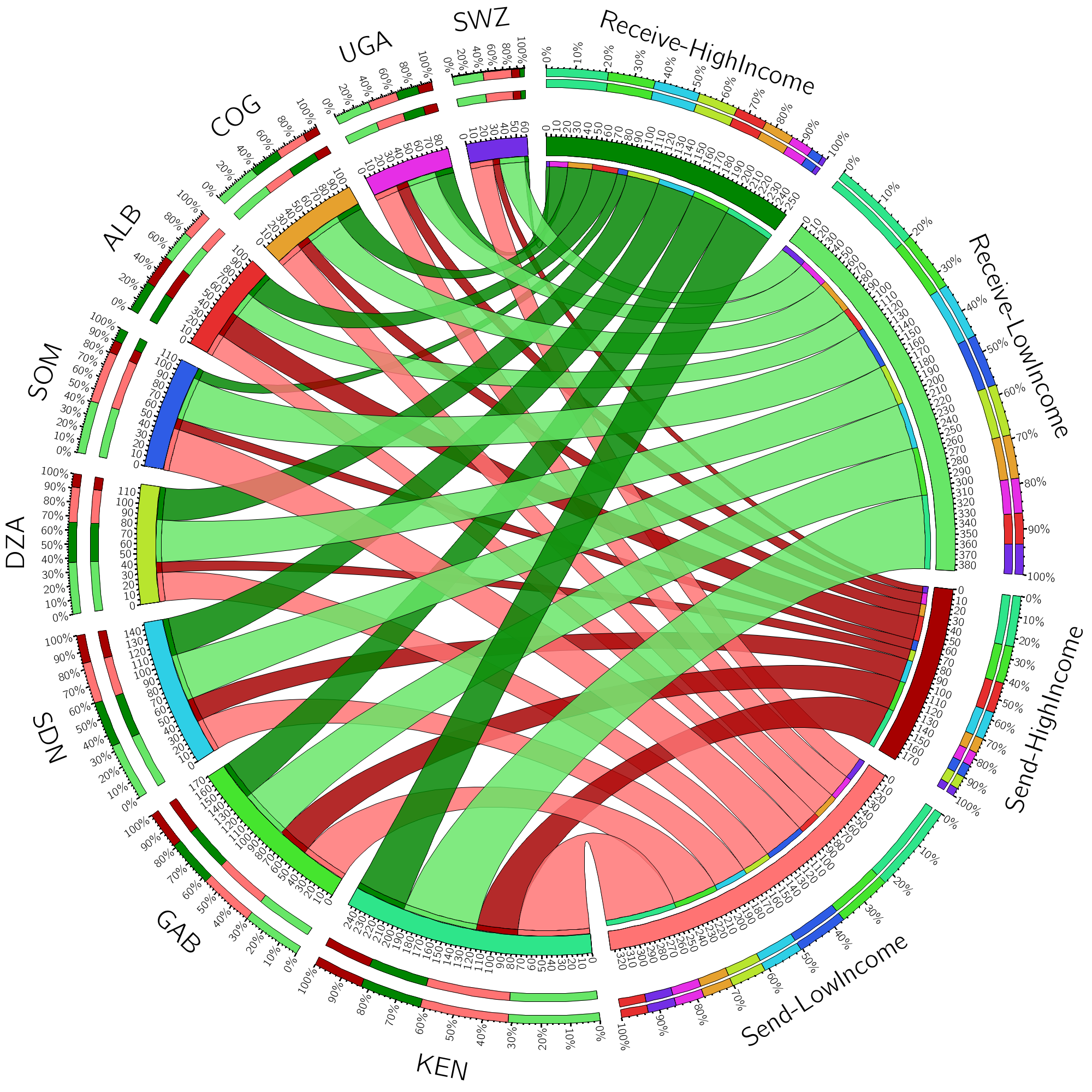
As Google, Apple, Paypal, Mastercard and the entire banking community fights over mobile money, we decided to look to the power users to find out what the near future of monetary exchange might look like. The World Bank’s treasure trove of open data on mobile banking is a well stocked pantry for the data hungry. Welcome to our first data snack and enjoy the graph we created below.
Percentage of Population Using Mobile Money
Separated by Income Levels
We looked at the top ten countries in percent of population having used their phones to send and receive money. Turns out, even in countries with the highest use – countries that are all among the world’s poorest) – it remains the poor within those countries who use mobile financial services more frequently. In each of the ten countries, the poor used mobile banking more than the rich.. A higher percentage of the bottom 40% in income were users compared with the top 60%.
The low income surprise
Kenya leads the world in mobile banking due to the trifecta of infrastructure (mmm sub sea fibre optics), government support, and the community banking paradigm exploded by Safaricom’s M-Pesa. In fact, as you can glean from our infographic, over 70% of the population using their cell phones to do some banking.
From the image above, we see that the lighter ribbons – referring to the low-income users – are larger for both those that receive mobile money with their phones (green) and, interestingly, those that send (red) as well. The trend is similar for each of these countries which lead the world in mobile money use.
Particularly striking differences occur in Somalia and Swaziland, where relatively few of the wealthy use mobile money compared with the poor.
Revolving around the Mobile Revolution
We decided to use the circular layout – leveraging Krzywinski et al’s beautiful genomics-oriented Circos – to capture the high data density while letting the reader easily explore the graph themselves. For example, Algeria’s (DZA) thin dark red ribbon shows that few of the wealthy send money, but nearly three times as many of the rich in the North African country (dark green) have received funds with their phone.
The overbanked?
There’s a number of questions suggested by this take and we look forward to exploring the data further. Why aren’t the wealthier using mobile money? Perhaps it’s because there’s a transaction value above which mobile doesn’t make sense. Or, perhaps they have more access to ‘traditional’ banking methods and haven’t felt the need to switch, or are able to pay for advantages that outweigh any conveniences of mobile.
We’re looking forward to looking deeper into these questions and anticipating and facilitating the growth of mobile money. The data is available for an additional 50 countries, and we only look at a small fraction of the results here. As mobile money alters international economics, it might be that us plastic credit card and paper money users are… overbanked?
Credit: The Next Web


