It’s hard to believe that social media could have any ancient components or gods of yesteryear. The newly adopted way of socializing is in its infancy in human years. But in tech years, social media is already 103 years old and its elders include the now defunked Myspace.com.
Myspace, believe it or not kids, was once the Prime Minister of social media networks. In 2003, when it was first launched, it was the pioneer that cultivated a host of look-alikes, including its now biggest bully Facebook. Between 2003 and 2005, Myspace dominated the playing field and was the most visited social network with over 100 million registered users. It even received more traffic than Google itself in 2006, and at its peak had at least 4.5 million people on its site at any given time. But by 2008, Myspace began its fateful decline into social rubbish.
Myspace became a network that was bogged down with clumpy, home-made layouts and huge, music files. Page load time slowed to a crawl. It got so bad, that I refused to visit anyone else’s profile because I didn’t want to wait for their indie-produced background music to begin. Facebook, on the other hand, allowed developers — people who know what they are doing — to build new applications and enhance the user experience, versus Myspace which built everything in-house (and didn’t do a very good job). In June of 2012, Myspace had only 25 million unique visitors.
In short, where did Myspace go wrong:
- Too Much User Input – What made Myspace a success also became part of its undoing. Users personalized their profiles to a point where the site became unnavigable. Facebook users, on the other hand, are restricted to the same profile design, only businesses get the option to explore their profile creativity.
- Most of the ad space was only available on the homepage. Individual profile pages didn’t have to share their space with ads. So no matter how big the network got, its lines of revenue didn’t expand. Unlike Facebook, who now has advertising on every profile page and within the feed.
- Impersonality – As much as Myspace sought to give the user a personal experience, it actually opened users up to a bunch of spam. Music-hawking spam Several times a day I would get a friend request from some local rapper looking to promote his latest demo. On Facebook, rarely do I get a Friend request from someone I don’t know, and they can’t oodle over my profile without my permission. It is definitely a more personal experience.
- Fatigue – Users simply got tired of Myspace. They were ready to hope on the newest trend.
- Exclusivity – Since its launch, Facebook was exclusive to college students. Once it opened its doors to everyone in 2006, it began its upswing into social network mega-stardom — attracting people who had been previously waiting at the door (without a college associated email address).
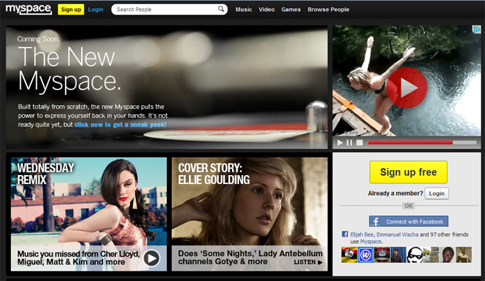
Now the new Myspace has decided it isn’t going to take its spanking lying down. Pop star Justin Timberlake and Specific Media LLC purchased Myspace in June 2011, and is recently abuzz with the site’s redesign. Call it MySpace gone Pinterest. It’s new profile layouts have a nifty board design that slides as you scroll. It also takes advantage of what made it popular — music. Each profile page comes complete with a Music Catalog and Mixes. And musicians can follow their Top Fans — with a cool-Google Earth, thing-a-ma-bobber — all over the world. Will MySpace entice people back to the network, or just encourage us old users to log into their old profiles (if we can remember the login)? That has yet to be seen. But it does show the corporate attraction to social networking and its awesome gravitational pull. Welcome back Myspace!
Credit: Social Media Today


Just took a second look at #MySpace… I think it’s actually a good-looking site. I hope the upcoming upgrades will kind of resurrect it… in some miraculous kind of way 🙂