

Fonts are one of the most powerful design elements in any digital product, yet they are often treated as a final detail instead of a core part of the user experience. A product team may spend weeks refining layouts, user flows, icons, colors, animations, and button states, but if the typography feels weak, inconsistent, or hard to read, the entire interface can lose quality.
Good font choices do more than make an app or website look attractive. They influence how users read, scan, understand, trust, and interact with a product. Whether you are designing a mobile app, SaaS dashboard, eCommerce website, fintech platform, health app, or productivity tool, typography quietly shapes the way users feel about your brand and the way they move through your interface.
Typography Is Part of the User Experience
In digital product design, every word on the screen has a job. A headline needs to capture attention. A button label needs to guide action. A form field needs to feel clear. A settings page needs to be easy to scan. A warning message needs to be understood quickly.
Fonts directly affect all of these moments.
When typography is strong, users do not consciously notice it. They simply feel that the product is clean, easy, and professional. When typography is weak, users may not know exactly what is wrong, but they feel friction. The product may seem messy, outdated, overwhelming, or difficult to use.
This is why typography should be considered early in the design process. It is not just decoration. It is a functional layer of the interface.
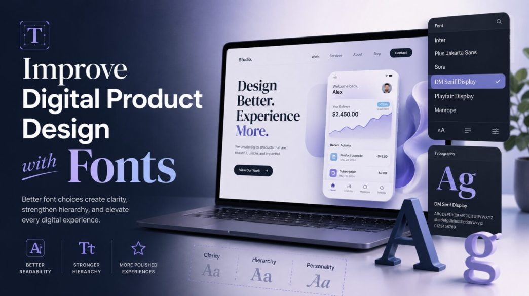
Use Reliable Font Sources
Designers today have access to thousands of typefaces. This is both helpful and risky. Too many options can lead to inconsistent choices, especially when a product team keeps downloading random fonts without a clear system.
A better approach is to use reliable font sources and create a controlled selection of typefaces for the brand. Designers can explore a free fonts library to find practical font options for product interfaces, branding experiments, landing pages, and design systems before finalizing the typography direction.
The key is not to use many fonts. The key is to choose the right fonts and use them consistently.
Most digital products only need one or two font families. One primary font can handle the main interface. A secondary font may be used for branding, headings, or special marketing sections. Using too many fonts usually creates visual noise and weakens the product experience.
Better Fonts Improve Readability
Readability is the first and most important reason font choice matters. A digital product can have beautiful visuals, but if users struggle to read the text, the design fails.
A readable font has clear letterforms, balanced spacing, and good performance across different screen sizes. This matters especially on mobile devices, where users often read in short sessions, under different lighting conditions, and while multitasking.
For example, a finance app should use a font that makes numbers easy to distinguish. A health app should use typography that feels calm and highly readable. A project management tool should use fonts that support scanning long lists, labels, comments, and task details.
Poor font choices can create small but repeated moments of frustration. Users may need to reread labels, zoom in, misread numbers, or skip important information. These small issues damage the user experience over time.
A strong font choice removes unnecessary effort. It allows users to focus on the product, not the text.
Typography Builds Brand Personality
Fonts communicate personality before users read a single sentence. A font can make a product feel modern, friendly, premium, playful, technical, minimal, bold, or trustworthy.
This is why font choice should match the product’s brand and audience.
A banking app should not use an overly decorative or playful font because users expect security and seriousness. A children’s learning app can use softer, friendlier typography because the experience should feel approachable. A luxury shopping platform may use elegant typefaces to create a premium feel. A developer tool may use clean, technical fonts that feel sharp and efficient.
The wrong font can create a mismatch between the product and the user’s expectations. Even if the interface works well, the brand may feel confusing.
Better font choices help create emotional consistency. They make the product feel like it belongs in its category while still giving it a unique identity.
Good Font Choices Improve Conversion
Typography also affects conversion. Clear, readable, and well-structured text helps users understand value faster and take action with more confidence.
On landing pages, better typography can make headlines stronger, benefits easier to scan, and calls to action more noticeable. In app onboarding, it can reduce confusion and help users complete setup. In checkout flows, it can make pricing, shipping, and payment details easier to understand.
Many conversion issues are not only copywriting problems. They are presentation problems. The message may be good, but if the typography is weak, the message loses impact.
A button label with the right font weight and size feels more clickable. A pricing table with clear typography feels easier to compare. A form with readable labels feels less intimidating.
Better fonts help users move forward without hesitation.
Font Pairing Matters
Font pairing is the process of using two or more fonts together in a balanced way. In product design, pairing should be subtle and purposeful.
For example, a designer may use a modern sans-serif font for the app interface and a more expressive display font for marketing headlines. This creates personality without damaging usability.
However, font pairing can easily go wrong. If two fonts have similar personalities but slightly different details, the design may look accidental. If they are too different, the interface may feel disconnected.
Good font pairing usually follows a few simple principles:
- The fonts should have clear contrast.
- They should support the same brand direction.
- They should not compete for attention.
- The more decorative font should be used less.
- The interface font should always remain highly readable.
For most apps and SaaS products, a clean sans-serif typeface is often the safest base. It works well for dashboards, navigation, forms, tables, modals, and mobile screens.
Spacing Is as Important as the Font Itself
A great font can still look bad if spacing is handled poorly. Typography is not only about choosing a typeface. It is also about how that typeface is used.
Line height, letter spacing, paragraph spacing, and margins all affect readability.
If line height is too tight, text feels cramped. If it is too loose, the content feels disconnected. If paragraphs are too long, users may avoid reading. If labels sit too close to form fields, the interface may feel messy.
Professional product designers pay close attention to spacing because spacing creates comfort. A well-spaced interface feels breathable and easy to use.
For body text, generous line height usually improves readability. For buttons and labels, tighter spacing may help create a cleaner look. For headings, spacing should help separate sections clearly.
Typography and spacing work together. One cannot fully succeed without the other.
Responsive Typography Improves Mobile Experience
Digital products are used across different devices, screen sizes, and environments. A font that looks perfect on a desktop dashboard may not work as well on a small mobile screen.
Responsive typography means adjusting font sizes, line heights, spacing, and layout behavior for different screens.
Mobile interfaces need special care because space is limited. Text should be large enough to read comfortably, but not so large that it breaks the layout. Headings should be clear but not overpowering. Buttons should remain easy to tap. Long labels should be avoided when possible.
A common mistake is designing typography only for large screens and then shrinking everything for mobile. This can make the mobile product feel crowded and hard to use.
A better approach is to design typography with real usage in mind. Test screens on actual devices. Check how text looks in forms, popups, error states, onboarding screens, menus, and cards.
Good responsive typography makes the product feel native to every screen size.
Fonts Influence Product Speed and Performance
Font choice can also affect loading speed. Heavy font files, too many font weights, and unnecessary font variations can slow down a website or app experience.
For web products, this is especially important. If fonts load slowly, users may see layout shifts, invisible text, or sudden font changes. This creates a poor first impression.
A practical typography system should use only the weights that are truly needed. For example, a product may only need regular, medium, semibold, and bold. Loading every possible weight can be wasteful.
Variable fonts can sometimes help because they allow many styles within a single file, but they should still be used carefully. Performance should always be tested.
Good typography is not just about appearance. It should also support a fast and stable user experience.
Typography Helps Users Scan Faster
Most users do not read every word on a screen. They scan. They look for headings, keywords, numbers, buttons, and visual cues.
Better typography supports this natural behavior.
For example, in a dashboard, users may need to quickly identify metrics, trends, alerts, and next actions. In an eCommerce app, they may scan product names, prices, discounts, ratings, and delivery details. In a booking app, they may compare dates, times, locations, and costs.
If typography does not support scanning, users feel slowed down.
Good font choices make important information easier to find. Proper weights and sizes help users separate primary information from secondary information. Clear labels reduce decision fatigue.
The faster users understand the screen, the better the product experience becomes.
Typography Should Support Content Strategy
Typography and content strategy are closely connected. If your product uses short, direct copy, you may need bold and clean typography. If your product includes educational content, long descriptions, or documentation, you need fonts that support comfortable reading.
For content-heavy products, body text becomes extremely important. A beautiful heading font will not help if articles, guides, or instructions are difficult to read.
Products with lots of data also need careful typography. Numbers, tables, charts, and labels should be easy to compare. In these cases, font clarity can directly affect decision-making.
Good typography gives content a proper structure. It makes information easier to consume and remember.
Practical Tips for Choosing Fonts in Product Design
When choosing fonts for a digital product, start with the user experience, not personal preference.
First, define the product personality. Should it feel serious, friendly, premium, simple, energetic, or technical?
Second, test readability. Use real product copy, not placeholder text. Check short labels, long paragraphs, numbers, buttons, and small captions.
Third, limit your font system. One strong typeface is often enough. Add a second only if there is a clear reason.
Fourth, create a clear type scale. Define heading, body, label, caption, and button styles.
Fifth, check accessibility. Make sure the font works with proper contrast, readable sizes, and different screen conditions.
Sixth, test performance. Do not load unnecessary font weights or files.
Seventh, document the rules. A typography system should be easy for designers and developers to follow.
These steps help turn font selection from a random visual choice into a professional design decision.
Common Font Mistakes in Digital Products
Many product designs suffer because of avoidable typography mistakes.
One common mistake is using fonts that are too decorative for interface text. Decorative fonts may look interesting in a logo or hero banner, but they usually fail in navigation, forms, and body text.
Another mistake is using too many font weights. This creates visual noise and makes hierarchy harder to understand.
Some products use text that is too small, especially in secondary labels, tooltips, and mobile screens. This may look clean in a design file but becomes frustrating in real use.
Another issue is weak contrast. Light gray text on a white background may look elegant, but it can hurt readability.
Designers also sometimes ignore localization. If a product may support multiple languages, the font must handle different characters and text lengths properly.
Avoiding these mistakes can instantly make a product feel more refined.
Final Thoughts
Better font choices can transform digital product design. Typography affects readability, hierarchy, trust, conversion, accessibility, brand personality, and overall user experience.
A good font does not simply make a product look better. It makes the product work better.
When typography is chosen with intention, users can read faster, understand screens more easily, trust the product more quickly, and take action with less friction. This is why professional app designers treat fonts as a core part of the design system, not as a small visual detail.